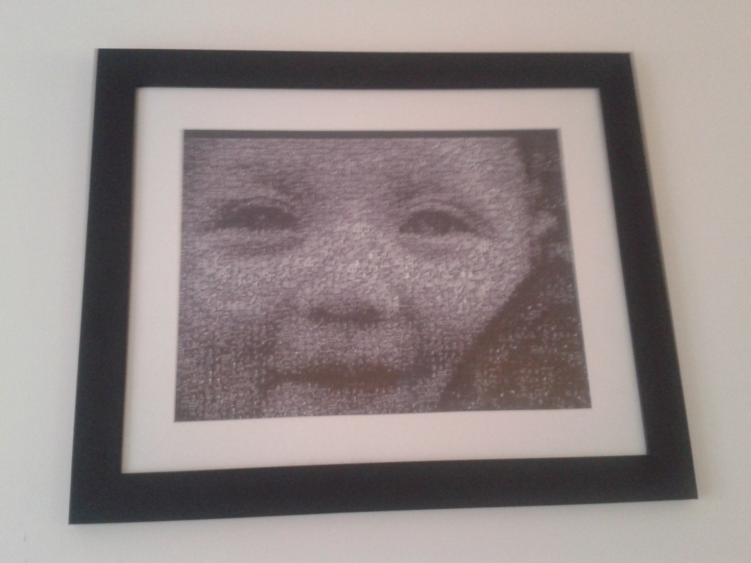
In our living room is a lovely picture of Naomi which I got Jay for Christmas a couple of years ago. It’s a mosaic of all the pictures we had of her until she was about 10 months old, combined into a larger version of one of them. Here it is: it’s about 40x30cm in a nice frame. 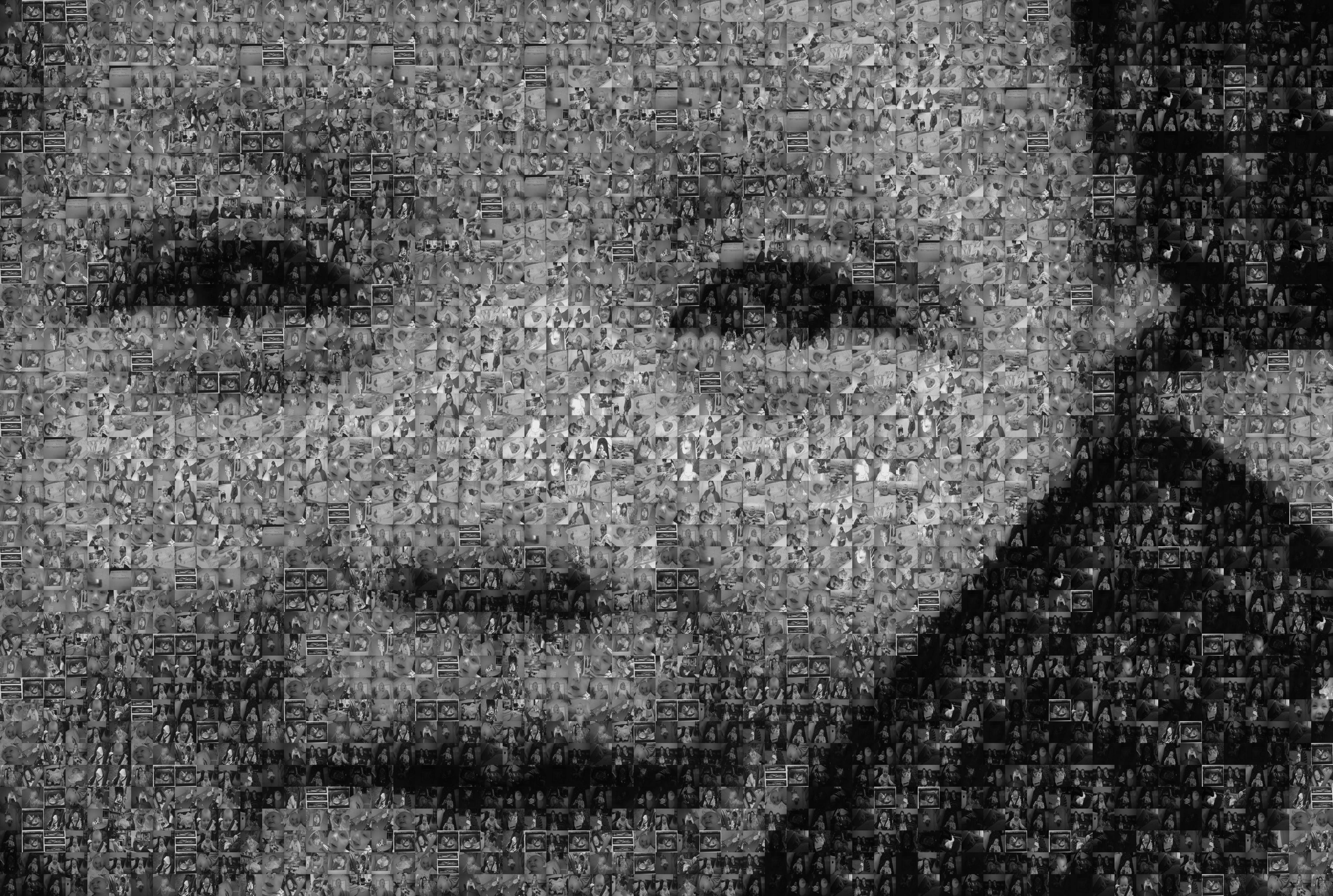
Here’s a brief guide to how I made it. It uses a free Linux program called metapixel. There’s another guide here, but I thought I’d share the specific steps I went through as it might be helpful. I’m in the process of making another one for Miriam – it took a while to remember everything I did so in part this is to aid me in case I ever want to put together another one… There are a few steps to complete, with an extra one because I found that the image works much better in black and white (it’s easier to make a mosaic that just matches shades rather than colour too). The original one of Naomi with colour looked like this:
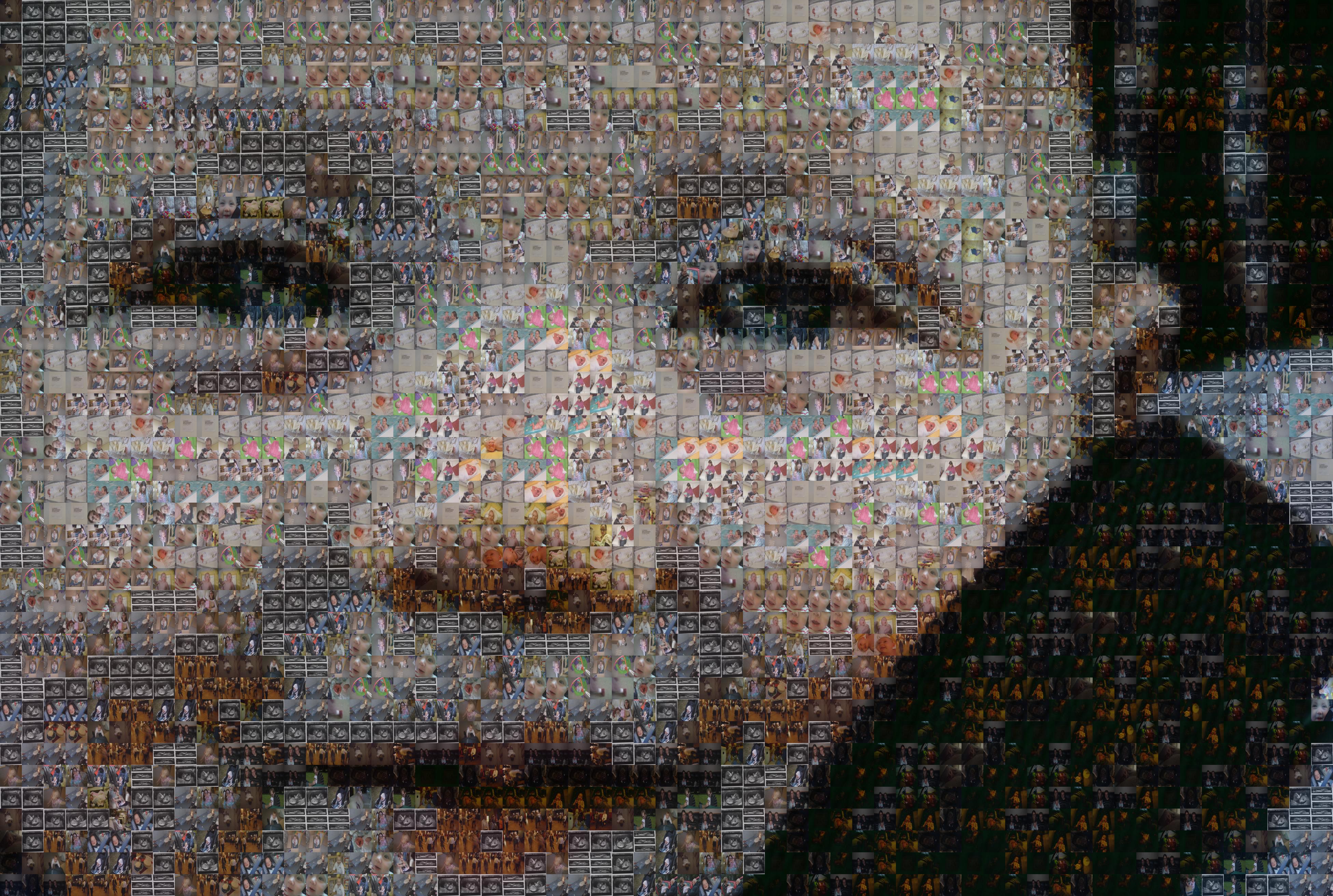
which is still good, but not quite as good. Maybe it’s worth trying both to see what works best for you. On to the instructions.
Step 1: install the following programs with your package manager:
- metapixel – actually generates the mosaic
- mogrify – does some batch processing on the images
Step 2: sort out a folder full of pictures for the mosaic tiles (the more the better), and choose one picture to act as the big one. A few more thoughts on choosing a big picture and tweaking it are at the foot of the post. I’ve put all the images in a folder called MiriamCombined.
Step 3: rotate the images so they’re all the right way up. Most pics taken with a phone or digital camera now have tags attached to them automatically to show where this needs to happen, and this can be done with the command below (the auto-orient option). Ones that don’t work need to be done manually 🙁 You might also want to convert the images to grayscale at this stage, by adding “-type grayscale”. This version of the command will overwrite the images, so make sure you’ve got a copy of them.
cd MiriamCombined
mogrify -auto-orient -type grayscale *
Step 4: create another folder to store the mosaic tiles in. Run “metapixel-prepare” to generate all the tiles (equally-sized versions of the originals). width and height set the size of the tiles in pixels. I found 64 works fine.
mkdir mosaic
metapixel-prepare -r --width=64 --height=64 MiriamCombined mosaic/
Step 5: Finally, generate the mosaic image itself. –library points to the directory we created and filled in step 4. There are lots of options but the ones I used are below. By all means, tweak them until you get a pleasing image, I did this a lot with Naomi’s one, then managed to more or less reuse the same ones for Miriam’s.
- “-s 1.0” sets how big the image should be: the original size is multiplied by this amount. My original is 3904×2624 pixels, which I found works just fine: we get 61 tiles across, which looks okay with a picture size of 40cm wide.
- “-a 40” allows metapixel to “cheat” – the original image is mixed with the mosaic to help the overall image look a bit smoother. This is a percentage: I found 40 to be a good balance between it looking too rough (not enough like the original image) and too smooth (not really a mosaic any more). You have to look quite closely to see the fading effect. This might need played around with to taste.
- “-d 8” sets the minimum distance between two tiles that are the same. If this figure is much higher metapixel can’t complete the image, much lower and you and up with many repeated tiles next to each other. This will be highly dependent on the number and variety of tile images that you have, as well as the big image.
- the last two parameters are the large image to base the mosaic on, the the filename to write the generated mosaic to.
metapixel --library=../mosaic -s 1.0 -a 40 -d 8 --metapixel DSC_0001.JPG DSC_0001-mosaic.JPG
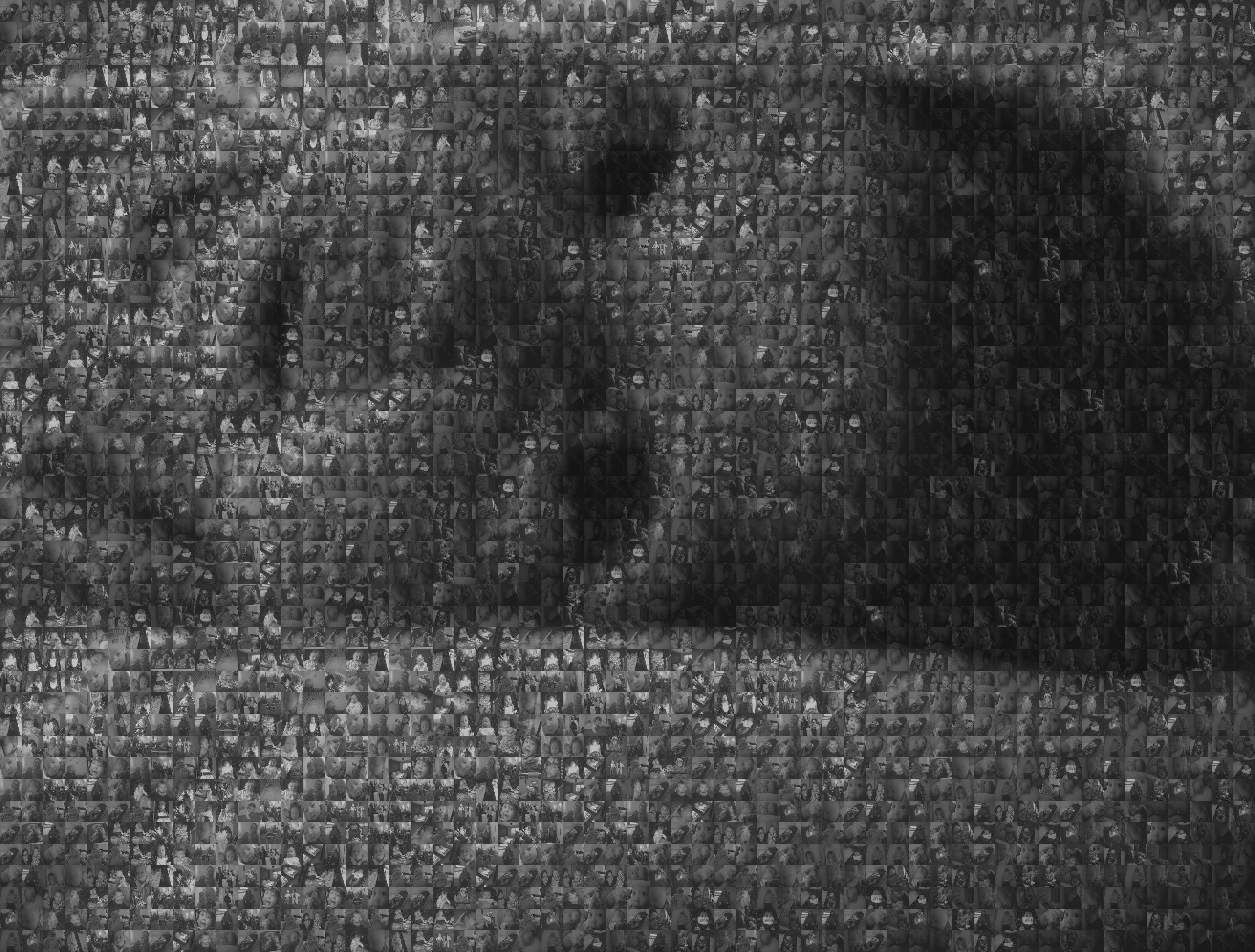
Here is the result:
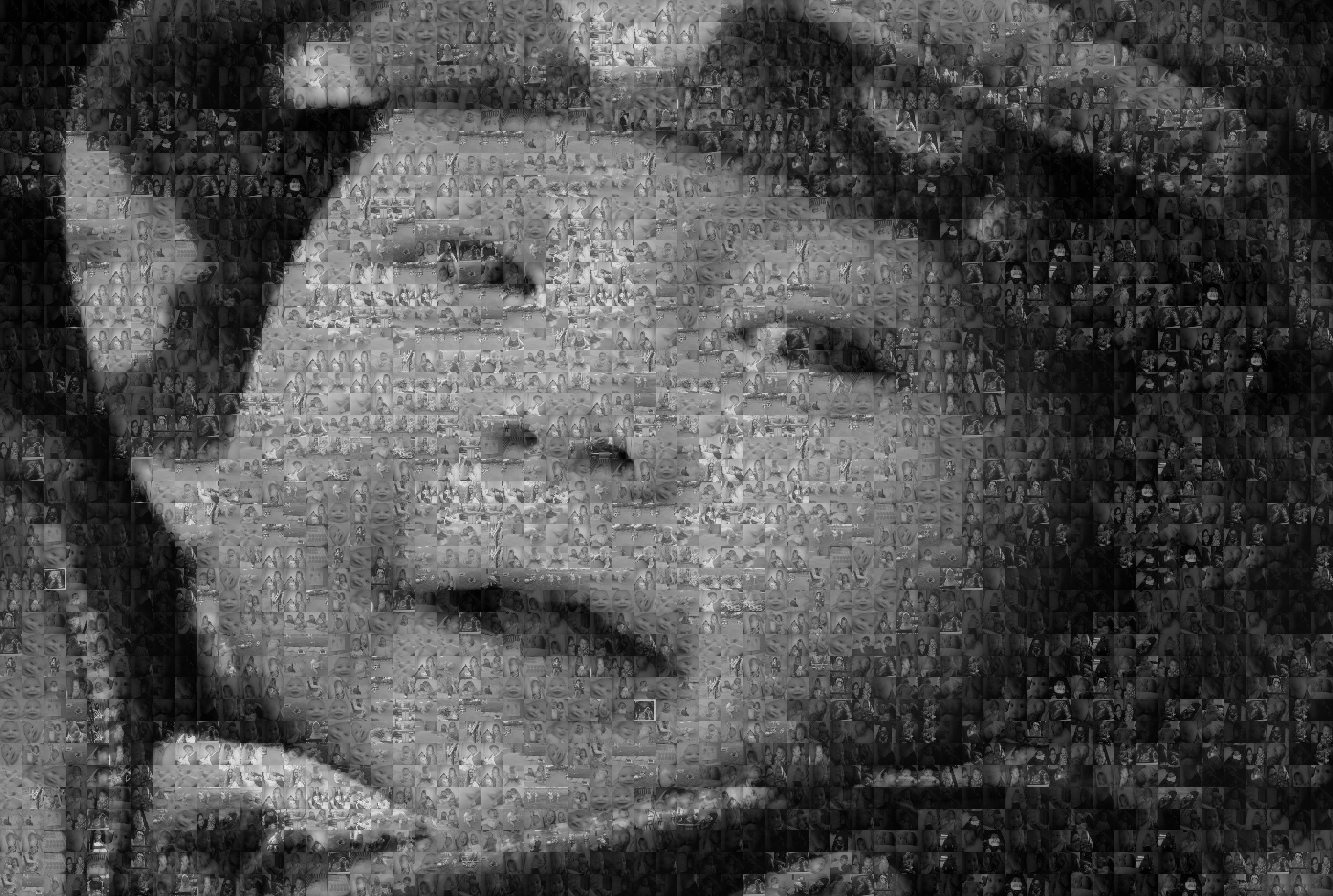
Thoughts on the large image: The initial picture I used for it didn’t work all that well, though at first glance it looks fine:
The original has a bit of noise in it (ie it was grainy), which caused some funky stripe effects in the final mosaic. This was fixed by blurring the original image a bit (I used the GIMP image editor). However, it was still too “flat” – and increasing brightness and contrast didn’t seem to fix the issue. When printed, as a result it always came out too dark-looking. Also, the narcissistic part of me was disappointed that the mosaics generated for this image rarely seemed to include pictures of me with my daughter! Alas, this image ended up needing to be dropped. Key message: make sure your original picture is right! I’ve found that the best images for a mosaic are:
- closeups of faces, or other easily recognisable images without lots of detail
- a wide variety of dark/light shades
- a mixture of smooth transitions and sharp edges between light.dark areas
Frame / finishing
To finish the whole thing off, we found a very good frame at a shop in Loughborough, but it doesn’t seem to be in stock any more (we tried to get one recently for Miriam’s picture). This one at IKEA seems to be pretty close though. The picture frame we used is for a print of 30x40cm: an A3 print or a Vistaprint small poster (for a few pounds) is about right though. You’ll need a black backing to fill in the slight gaps top+bottom.
The finished result for Naomi’s picture looked like this:
I hope that’s of some use. Enjoy making some nice pictures!